A lot of people ask me where is a good place to start with Website Design?
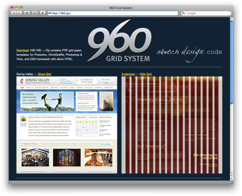
I tell them to check out the 960 Grid System. It is a development workflow
system that allows website designers an easy blueprint of
web development in 960 pixels width. There are two main
variants to the 960 grid system, 12 and 16 columns, which you
can use separately or in tandem.
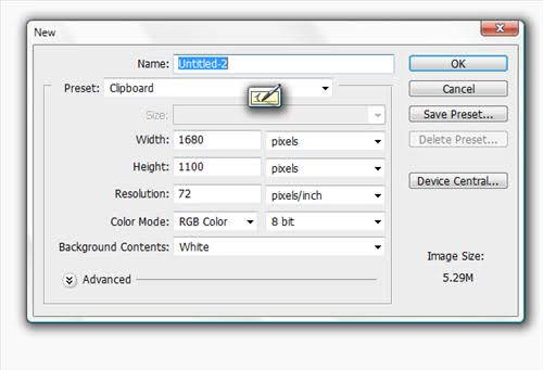
Step 1: Create a new document in Photoshop
You will want to open Photoshop and use a width of 1680px and a height of 1100px, then fill the background with #F9F9F9, which is a light grey color.
Step 2: Adding the Grid to your Photoshop document
Although we are talking about the 960 Grid System by Nathan Smith, it should be noted there are other grid systems you can use in Web Design. Just do a search on the Internet for “Web Design Grid System” and you will find several. The 960 Grid System is great because for one, it is widely used, and two it is simple and fits most screens, from 15″ and above! Plus you can easily switch to a fluid width web site and adapt to 25″ and larger screens.
By now you should know that you need to Download 960 Grid System.
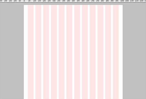
Once you download the file, extract it and open the “Templates” folder. Open the 960 12 column grid in Photoshop.
The next step is to insert the grid into the document that we have created. Select the “12 col Grid” group and merge, then copy and paste it into the main document. Or you can skip the previous step and just edit the template file you have just created. Keep in mind, any changes you make will be saved to the “templates” folder within the archive you just extracted!
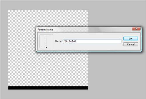
The next step is to create a baseline grid. This helps with areas such as spacing elements and line-height. Start with a new document which is 24px by 24px, delete the background and draw a 1px line along the bottom of the document. You need to define this as a pattern by doing: EDIT > Define Pattern and give it a name you will remember.
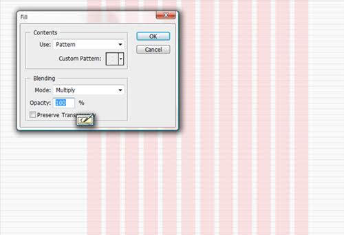
Okay, create a new layer here, then fill the layer with the pattern, Edit > Fill. This will be the baseline grid.
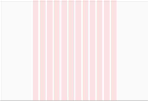
Now we need to mark out the area’s we will be working with by using guides. So create a new view guide by View > New Guide, then select vertical and create guides at 360px, 840px and 1320px, the reason we put these guides is so we get to 960px working area between 360px and 1320px and a central line at 840px.
Save as a Template
Okay, so we have created our template. Now you can save it and use/reuse it when necessary. This setup keeps things simple, and you can change the height of the canvas depending on your web design project.
Step 3: Starting the Design
Look for the next post in this series of 3. I will provide the links when I finish writing the rest!
Info on the 960 Grid System
The 12-column grid is divided in 60 pixel portions and the 16-column is 40 pixels.
Each column has 10 pixels margin on the left and right, which creates 20 pixel wide gutters between
columns. The purpose of the 960 grid system is to provide
a quick development environment for web developers. The CSS
is already written and there are a ton of templates to work off. Many other
large web companies are using the 960 grid system to
design their websites
